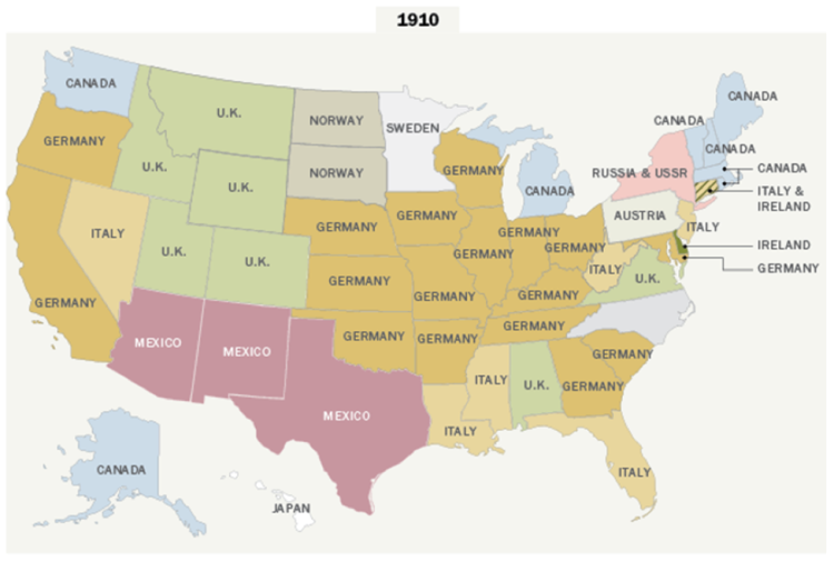
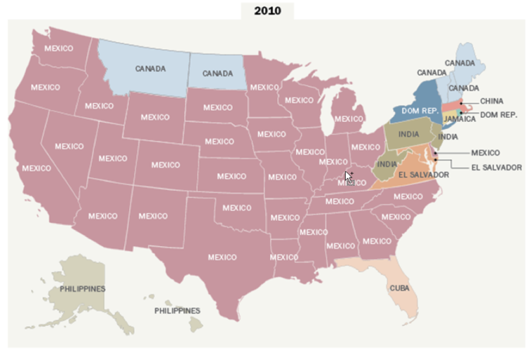
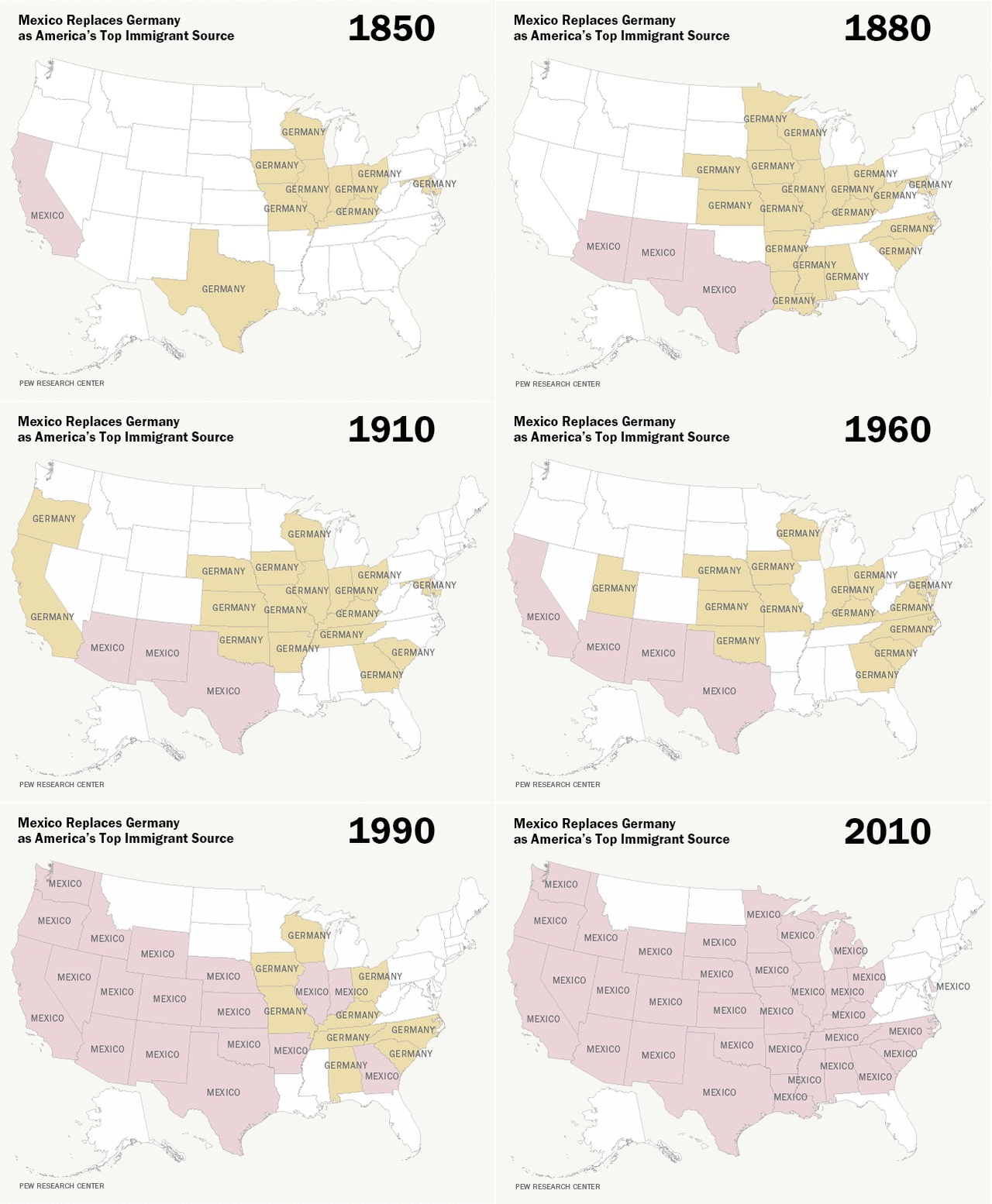
We recently came across these interesting maps created by the Pew Research Center showing the changing demographics of the foreign-born population in America. Several media outlets featured these fascinating maps where Pew compared the biggest sources of immigrants into each state in the U.S. from 1910 and 2010 census.
Where Each State’s Largest Immigrant Population Was Born
Top nation of origin by state
Source: Pew Research Center
You’ll notice that many states had a majority of their immigrant population coming from Germany prior to 1965. This was partly because of a series of laws that were passed in the early 20th century that set quotas on entrants by country which effectively banned immigration from all places except Western Europe and Latin America. These laws were repealed by the Immigration and Nationality Act of 1965 which gave us essentially the system that is still in use today. By 2010 Mexico dominated as the country sending the most immigrants to the U.S except for a handful of states, mostly in the northeast.
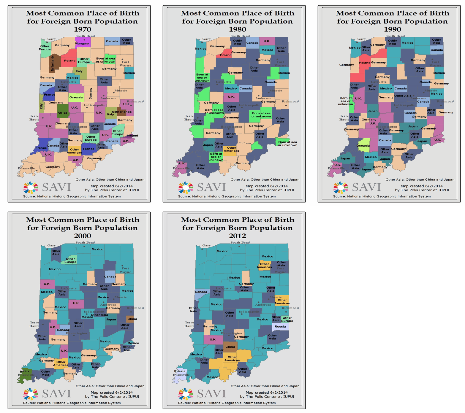
Pew’s maps prompted us to take an in-depth look at Indiana immigration through the years.
Here’s what we found:
We saw a similar trend in Indiana to the national trend. The maps for 1970 show that Germany and United Kingdom dominated as the most common country of origin. Moving through time to 2012 by decade brings us to a map dominated by Mexico and Asian countries other than China and Japan.
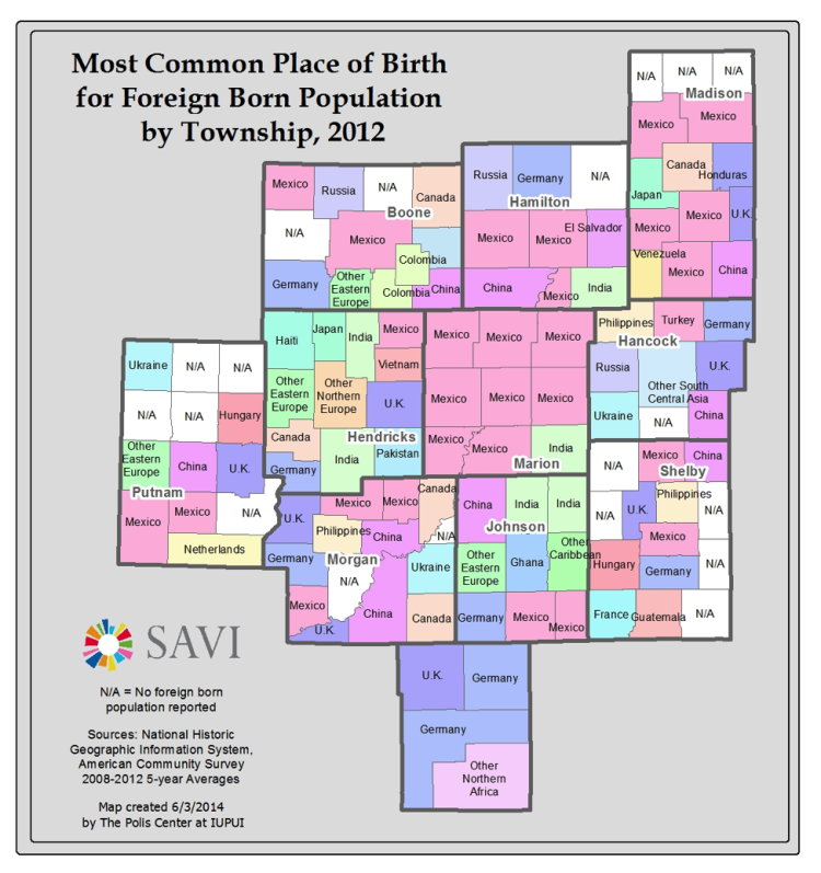
We took an even more detailed look at Central Indiana by township which revealed some really interesting results. Sure, in 2012 it seems like Mexico was the dominant country for the foreign born population, however it’s also fascinating to see countries from around the globe such as Vietnam, Pakistan, Columbia, Haiti, Japan, Ghana, and three townships where the largest number of immigrants were born in Ukraine.
Pew also reports that net migration from Mexico has slowed dramatically in recent years and perhaps has even reversed some.


