Data visualization is a way to see large amounts of data in one pictorial or illustrative graphic. It helps you to quickly draw attention to key findings/takeaways and observe patterns that are not apparent when looking at data in a table format. There are so many kinds of ways to visualize data including graphs, timeline maps, tree maps, infographics etc. however, charts are still one of the most popular methods of data visualization.
Did you know SAVI allows you to not only browse data but also visualize it via charts, graphs and maps? SAVI’s charting tool gives you the flexibility to analyze data, including trend analysis and community comparisons beyond what can be done using maps alone. It also allows you to compare geographic areas, view changes over time, and view population distributions in a pie chart, bar chart, or line graph. A wizard guides you through a series of questions to build a chart.
Here’s how to create a chart in SAVI in 6 easy steps:
- Go to www.savi.org
- Click on the USE SAVI tab
- Click on the Charts tab
- Use the charting wizard to set up your chart
- Click the Create Chart button
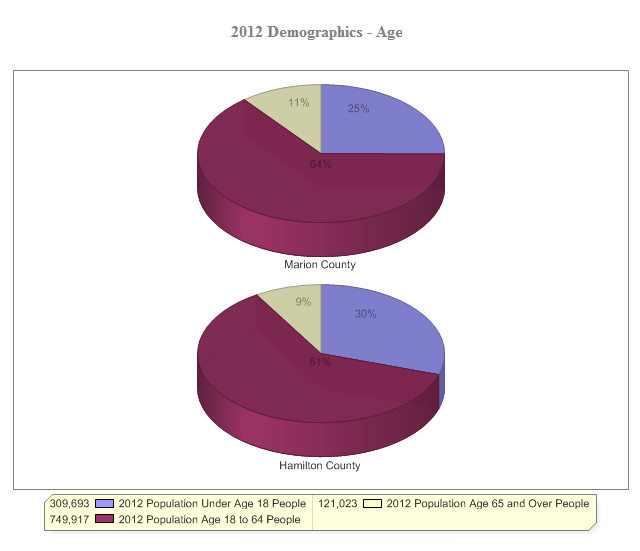
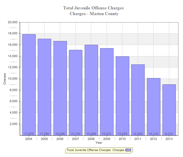
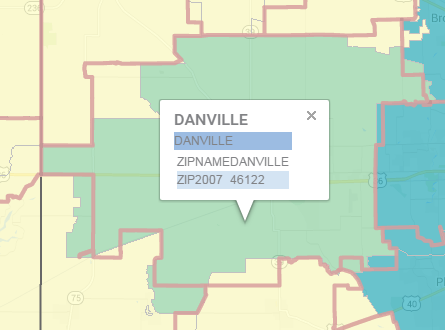
Here are a couple examples of charts you can make using SAVI.

Do you want to learn more about charting using SAVI? Register TODAY for tomorrow’s (Thursday, September 4) FREE Charts and My Projects webinar.


