Why Does Income Diversity Matter?
Many community development efforts are focused include the creation of mixed-income communities among their goals. One hypothetical benefit is that mixing income groups will open social networks and allow low-income individuals to make connections will better-resourced individuals, building their social capital. This could lead to concrete quality of life improvements, like job opportunities, educational opportunities, or information about schools and other resources.
Another hypothetical benefit is called political economy of place (Joseph, Weber, and Chaskin 2007). The theory is that if high income residents are in a neighborhood, they will command political attention and attract resources for things like basic services, education, and infrastructure. Of course, it is debatable whether this is the best way to address unequal distribution of public resources, but perhaps it is a pragmatic approach.
In recent decades, the U.S. Dept. of Housing and Urban Development has employed this philosophy through HOPE VI, a program that dismantles public housing projects and redevelops them as mixed-use, mixed-income communities. There is a body of research attempting to discern if the promise of social integration is borne out in the results. However, as Fraser, Chaskin, and Bazuin conclude:
[T]he possibility of promoting access to the social networks and resources of higher income neighbors in ways that might promote instrumental gains, such as access to employment or information about schools, services, or other resources, generate no clear benefits.
There is consensus among researchers that low-income residents have largely not benefited economically from interacting with high-income residents. As this study from the Urban Institute explains, “Research has not lent support to the hypothesis that interactions among residents across income levels will be the primary mechanism by which benefits will be derived.”
However, the theory about benefits from neighborhood-level improvements does seem to play out. The Urban Institute finds evidence in the research for effects like, “improved housing quality, increased safety, and improved property management, and improved mental health from a reduction in stress.”
For more reading on the efficacy of social mixing, see Lees 2008, Kleit 2011, and this review from Urban Institute (Levy, McKade, Dumlao 2010). For reading on HUD’s HOPE VI program and perceived need for mixed-income developments, see their report Confronting Concentrated Poverty With a Mixed-Income Strategy.
Low-income residents have largely not benefited economically from interacting with high-income residents. However, the theory about benefits from neighborhood-level improvements does seem to play out.
There is room for debate about the goals and efficacy of mixed-income neighborhoods. Perhaps there are benefits outside of socioeconomic measures for integrating income groups. Maybe we, as a society, value the de-concentration of poverty from an ethical perspective.
But that debate begs the question: Where are Indianapolis’ mixed-income neighborhoods? Which neighborhoods lack income diversity? That is what we set out to discover here.
How Do You Measure Income Diversity?
To measure mixed-income neighborhoods, we borrow methods from ecology: the measurement of diversity. Ecologists often need to measure species diversity within a habitat, called alpha diversity. Then, it is possible to compare that habitat’s diversity to other habitats, or to the same habitat over time.
We can apply the same statistical methods to income diversity. We use a measure called Simpson’s Index. It is a measure of the probability that, if you select two individuals from a neighborhood, they will be from different income groups. Specifically, we used the Inverse Simpson’s Index, and then expanded it to a normalized scale of 0-100 for ease of interpretation. At zero, all households are in one income group. At 100, there is perfect diversity.
There are difficulties with this method. First, we need to divide households into income groups in order to use this method, but those are somewhat arbitrary. We used ten categories available from the U.S. Census. Furthermore, households are not spread evenly across these groups. Most are concentrated in the middle. So, while a neighborhood with 10 percent of households in each of ten income groups would be perfectly diverse, it would not match the overall income distribution of the region.
Second, we need to divide people into geographic boundaries. We used census tracts to approximate neighborhoods. But as geographies get larger (like counties or states) income diversity is likely to increase. (Just as you are more likely to find more diverse species if you look at a larger habitat, you are likely to find more plentiful income groups in a county than in a neighborhood.)
Bearing in mind those challenges, we analyzed income diversity for each tract in the Indianapolis region.
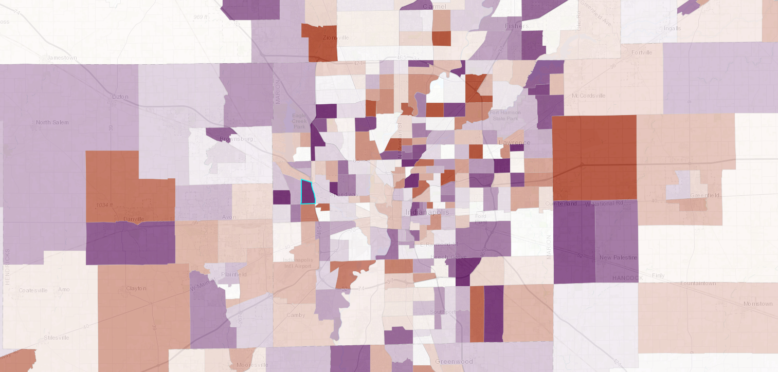
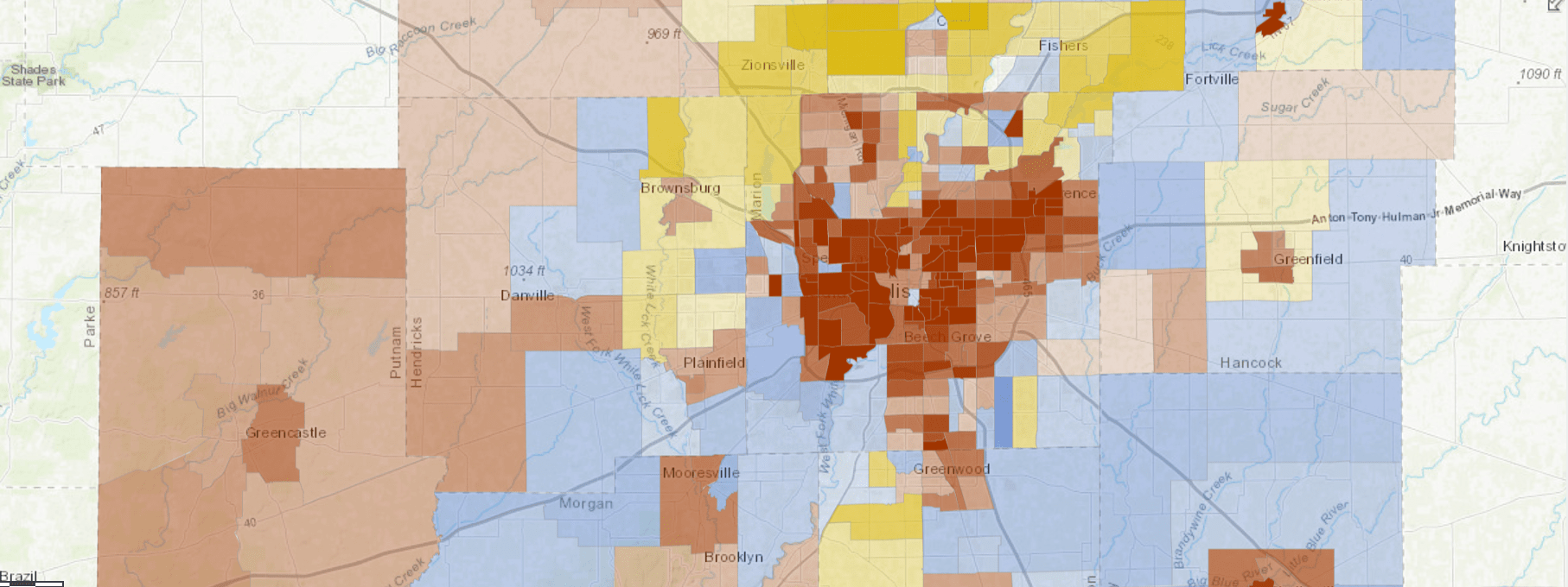
Marion and Boone County Are More Income Diverse than Indiana
Income Diversity by County
Results
When we map the neighborhood results, the map stands out as different from most maps of socioeconomic indicators. Areas with high and low income diversity are mixed across the region, occurring in urban, suburban, and rural places. The typical tract (median) has a score of 61.04 and has decreased by 1.01 since 2011. The metro region overall scores 81.29.
Counties tend to be more income-diverse than neighborhoods, which makes sense because they are larger and are more likely to include many groups. Marion and Boone counties had the most diverse mix of incomes.
There is a corridor of mixed-income neighborhoods that stretches from Mass Ave., Holy Cross, and nearby areas up to 56th Street along College Avenue and Meridian Street. Some of these are gentrifying tracts, but we found no significant relationship between income diversity and neighborhood change (or even change in income diversity and neighborhood change).
Some of these neighborhoods are mixed-income because they are in transition. Some of them appear to be stable, and may remain mixed-income. We will look at three of the most income-diverse neighborhoods in the region. In future weeks, we will learn more about the least income-diverse and those that are changing the fastest.
Income Diversity Shows Different Spatial Patterns than Most Socioeconomic Measures
Census Tracts with High and Low Income Diversity
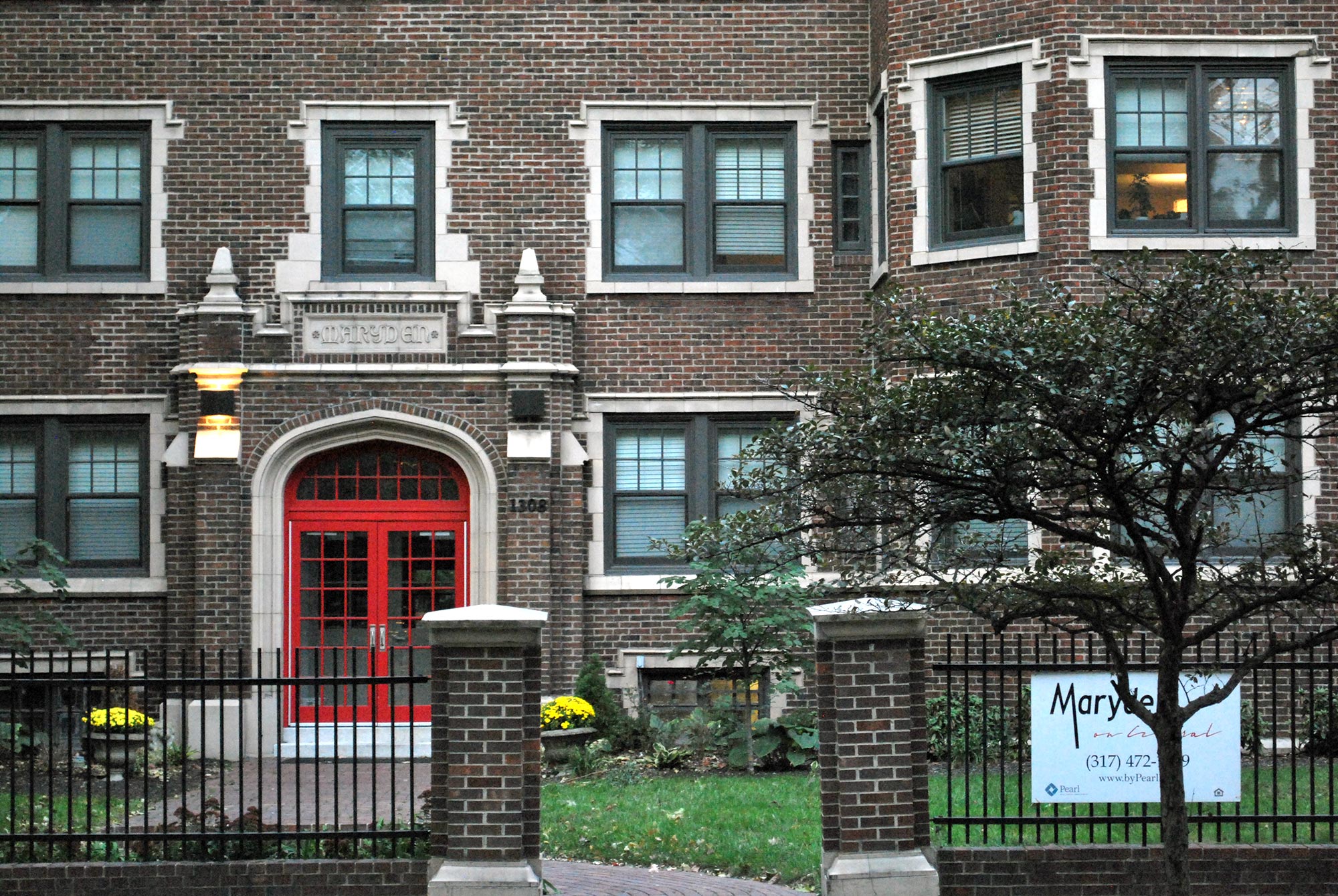
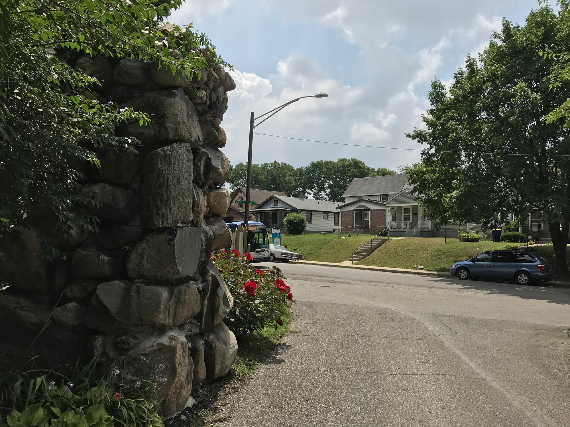
High Income Diversity in Old Northside
Income Diversity in Tract 3909 in 2016
Three Examples of High Income Diversity
Old Northside
In tract 3909, which is the Old Northside, the largest number of households (14.9 percent) have extremely low incomes below $10K. But at the same time, there are five other categories with more than 10 percent of households in them, ranging from $25K to $149.9K. Across all categories, distribution ranges from 5.2-14.9 percent. This evenness accounts for the tract’s high income diversity score of 87.01, the highest in the region.
[Explore the Old Northside’s Community Profile]
In the Old Northside, million dollar mansions and $600K row houses share the block with $150K condos. On New Jersey Street, newly built and historic foursquare duplexes offer attached single-family units affordable for households with income at $100K and above. Amidst these single-family homes, there are apartment buildings, two-flats, and divided homes where monthly rents can range from $400 to $2,000 and above (2016 American Community Survey [ACS]).
This mix of housing types create opportunities for households of all income levels to live in the Old Northside. Out of every ten units here, four are single-family detached homes, four are in apartment buildings with three or more units, and one is an attached single-family unit (according the 2016 ACS). While 25 percent of units are large with at least eight rooms, another 25 percent have only 2-3 rooms, and 5 percent have only one room.
The housing mix also means a mix of renters and owners. Homeowners make up 35 percent of the neighborhood and renters make up 65 percent. And though the median monthly mortgage is here is $1,621, 46 percent higher than Indy’s average, the median monthly rent is $749, lower than average.
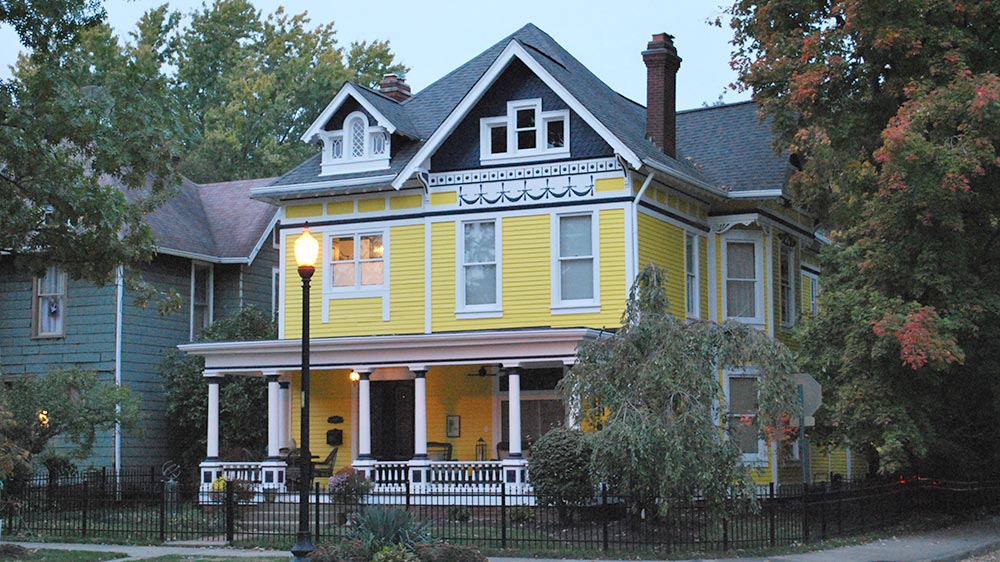
A mix of apartment buildings, large homes, condos, and row houses create the opportunity for a mix of residents at different income levels to live in the Old Northside.
Matt Nowlin
High Income Diversity Near Rocky Ripple, Crows Nest
Income Diversity in Tract 3211 in 2016
Rocky Ripple and Crows Nest
Tract 3211 contains some of Rocky Ripple and Crows Nest. Its income diversity is 85.99, relatively unchanged since 2011. This high diversity is because of the presence of every income group and a high degree of evenness between income groups. About 31 percent of households are near the median income ($50K-$99.9K), 43 percent below that, and 27 percent above that.
[Explore this area’s Community Profile]
This neighborhood was mostly built between 1940 and 1979, and has not experienced much development since (2016 American Community Survey). Eight in ten housing units are single family homes. In this early suburb, there is not the mix of owner-occupied, rental, detached, and attached housing types found in the Old Northside. But these homes vary widely in value. According to estimates of owner-occupied home values from the ACS, 38 percent of homes are worth $100K-$199K. But there are also many very expensive houses (20 percent are worth $500K or more) and less expensive houses (12 percent are worth less than $100K).
Homes Value Range Widely Near Rocky Ripple and Crows Nest
Estimated Home Values in Tract 3211 in 2016
This tract includes Rocky Ripple, a largely middle class neighborhood, and Crows Nest, a wealthy enclave once home to Eli Lilly. Crows Nest was actually founded as a separate town in 1927, but combined with Indianapolis in 1970 as part of Unigov. (See Invisible Indianapolis for a history of the town and an exploration of domestic laborers that worked in its estates.) Rocky Ripple itself has a median income of $48.9K. Median income is $78.4K in the blockgroup that includes Crows Nest. Closer to Michigan Road, the median income is lower, at $39.1K.
Near Pike H.S., Income Groups Grew More Even Since 2011
Income Diversity in Tract 3102.03, 2011 and 2016
Near Pike High School
Tract 3102.03 is near Eagle Creek and Pike High School. It has become much more income diverse since 2011. This is mostly because the share in the lower and higher ends of the income spectrum grew. In this case, the tract was mostly concentrated in the middle class in 2011. Though not as income diverse as it would be in 2016, it is hard to argue that this is a negative in terms of policy implications. Since then, income distribution in the tract has actually become more polarized. As a result, there is more evenness across income groups. (The concentration in the middle fell, while the concentrations at the poles grew.) If the middle income concentration continues to fall, the area may become less income diverse and increasingly polarized.
[Explore this neighborhood’s Community Profile]
The owner-occupied housing stock does not vary much in value. Three out of five homes are worth $100K-$175K. But four in ten residents are renters. And two in ten housing units are in large apartment buildings with ten or more units. There are several large apartment complexes that create the opportunity for renters to live in this area.
This neighborhood is racially diverse, in addition to being income diverse. The area is 43 percent white, 42 percent black, 13 percent Latino, and 2 percent Asian.
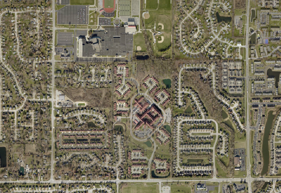
Aerial view of Pike High School and the surrounding neighborhood. Dense single family suburban homes stand near large suburban apartment complexes.
Image: City of Indianapolis
Now Explore Your Neighborhood
How Each Tract Scores in Income Diversity
Income Diversity by Tract (2016)
See How Your Neighborhood Has Changed
Find more interactive content from our series on neighborhood change.
No Results Found
The page you requested could not be found. Try refining your search, or use the navigation above to locate the post.
Next Up
 Indy Neighborhoods with Fastest Changing Income Diversity
Most neighborhoods became more mixed-income between 2011 and 2016. Farley, near Ben Davis, had the biggest increase in income diversity, while the historically black suburb Grandview had the biggest decrease.
 Indy’s Least Mixed-Income Neighborhoods
Explore neighborhoods where residents are highly concentrated into a few income groups. We dive into examples of concentrations of low-income residents, high-income residents, and middle-income residents.
 Income Inequality High Where Golden Hill and Northwest Indianapolis Converge
In the area where wealthy Golden Hills converges with the working-class neighborhoods of Northwest Indianapolis, income inequality is high and increasing. The area is also experiencing a growth of white households above the median income.
 Changes in Indy’s Historic Black Neighborhoods
In the 1970s, 4,000 residents left this nearly all-black neighborhood. Why? An increasingly desegregated housing market and closure of one of the country’s first public housing projects.