Recently, a SAVI user with the North American Mission Board (NAMB) contacted us to help compile and visualize data on population change in Central Indiana between 2000 – 2013. NAMB works with churches, associations, and state conventions to plant new churches in fast-growing neighborhoods. To help them identify these neighborhoods, I created some maps showing population change since 2000 by a few different geographies. Some of the results were predictable, while others were a little more surprising.
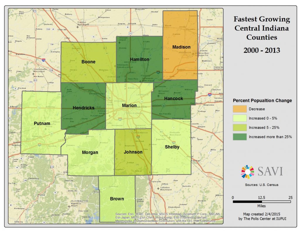
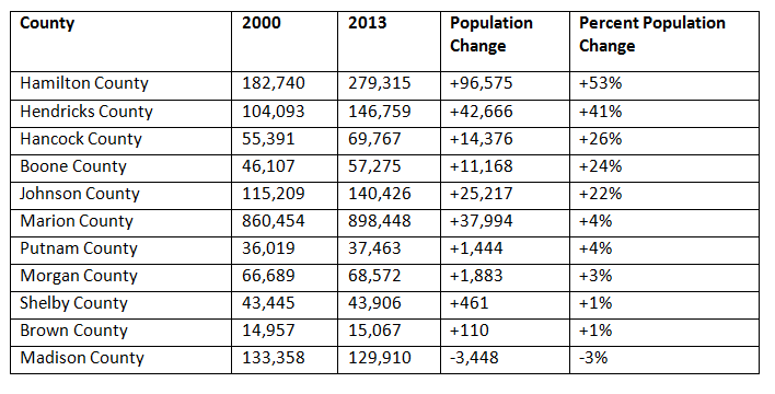
First, let’s look at a map showing population change based on comparing 2000 Census data to the 2009-2013 American Community Survey 5-year averages.
It’s no surprise to see that the donut counties show the strongest growth since most of the growth around Indianapolis has been in suburban areas, and much of Marion is either “built-out” or experiencing economic struggles leaving less potential for growth. Hamilton County leads the way with a growth of 53% over the 13-year period. The only county to lose population was Madison County.
Dans cette situation, le Viagra peut être un déclencheur du développement du priapisme, mais seulement si l’homme présente des pathologies concomitantes à celui-ci. En fait, le médicament ne présente aucun danger potentiel, l’essentiel étant de tenir compte des contre-indications existantes Précautions et mises en garde concernant l’usage de Tadalafil ainsi que de respecter le dosage autorisé. Une utilisation correcte du Viagra aidera l’homme à se débarrasser de nombreux complexes liés aux troubles de la sphère sexuelle.
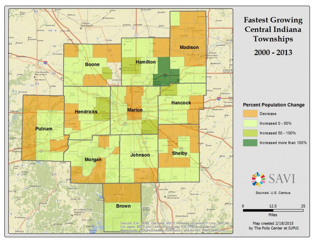
Now let’s examine the growth in a little bit more detail by looking at population change by township. We see that the undisputed king of population growth in Central Indiana is Southeastern Hamilton County, which includes the fast-growing town of Fishers. Areas that lost population include rural areas, Anderson, and parts of Indianapolis. Note that we don’t show townships in Southeastern Boone County because those townships’ geographic boundaries changed a few years ago preventing us from making comparisons to 2000.
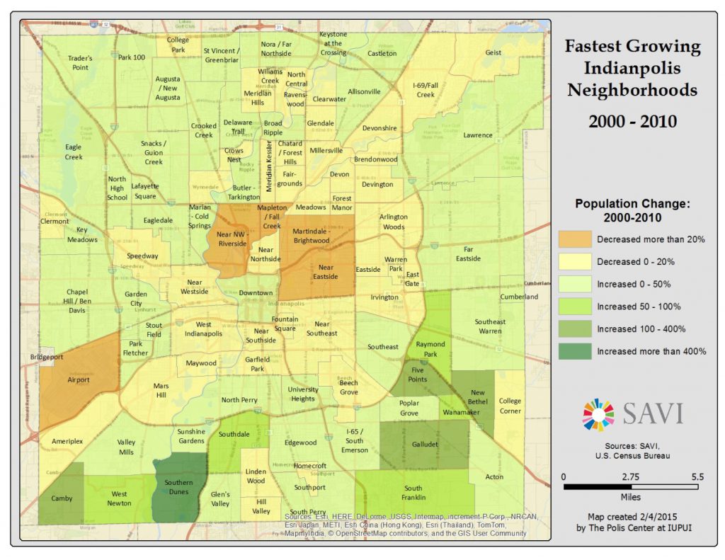
Our final map shows areas of population growth and decline in Indianapolis neighborhoods. We see the biggest declines are in near east and near north neighborhoods and the strongest growth is in the southern parts of Marion County in neighborhoods, which saw large subdivisions built after 2000. The area surrounding the airport lost population since the Indianapolis Airport Authority purchased many homes to comply with aircraft noise abatement regulations. Note that the latter comparison year here is 2010 rather than 2013, as newer data are not yet available. If we could do the comparison to 2013, we would likely see stronger growth in the downtown neighborhood as new apartments and condominiums continue to be built.
As you can see, organizations wanting to focus on areas of population growth have many things to consider when choosing locations in which to focus their efforts. Were any of these findings surprising to you? If yes, please leave a comment below letting us know what you think.


