Quickly Learn About Your Community
Discover. Explore. Monitor. With SAVI’s new Community Assessment Tool, it’s a breeze to create a report about needs and assets for any scope your organization chooses. What resources does a community already have? What’s the poverty rate in a county? How many kids under 18 are food insecure in a township? With the SAVI Community Assessment Tool you can quickly gather answers to questions like these.
With the Community Assessment Tool, you are guided step by step through scope selection, needs analysis, cataloguing assets, and considering opportunities, all powered by the extensive SAVI dataset. These steps build into a customizable report that you can even download in Microsoft Word.
Key features of this tool:
- Easily compare key indicators between different areas
- 80+ indicators available about education, financial stability, health, and basic needs to learn about a community
- Tool generates customizable charts
- Automatically creates an editable community assessment report
- Interactive maps to understand where resources are
- Look at disparities across age, race, gender, and economic status
Our Mock Assessment
To give you an idea of how this new tool can help you make strategic decisions, we are going to walk through an assessment for a fictional organizations, called Funasium.
Funasium is an established community center in Wayne Township looking to develop a program to improve the quality of life for children in poverty. For this report we are attempting to reveal key demographic data about who is reflected most in Wayne Township’s poverty rate and decide what specifically we can offer to reduce the impact of poverty.
Step 1. Define Scope
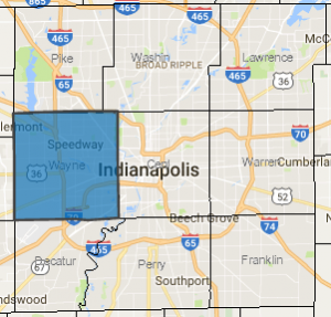 We chose Wayne Township for the scope of assessment, because our organization is based there and the program we are developing is intended to focus on this area. The topical focus of our assessment will be youth experiencing poverty.
Step 2. Assess Needs
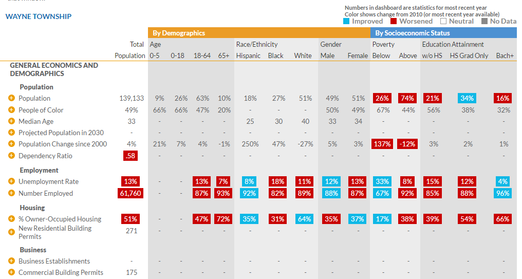
The dashboard is the heart of the needs assessment step. The far left column shows indicators like population, employment, and housing. For each indicator, we show a row of values. First, we show the value for the overall population, then we break that indicator down by demographics and socio-economic status. Numbers in red indicate the value has worsened since 2010, and blue means it has improved.
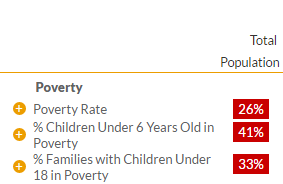
The Assessment Tool gives you a lot of data. To make it meaningful, we must focus on the indicators defined in our scope. Metrics on poverty can be found on the dashboard in step two under “Poverty” in the “Financial Stability” section.
We find from this dashboard that families with children under six have a higher rate of poverty than any other group. The top row shows that 26% of the entire population of this area is in poverty, while 41% of children under at 6 are in poverty.
If we dive more into that group (by looking across the row for the % Children Under 6 Years Old in Poverty), we see that more than half (56%) of Hispanic families with children under six are living in poverty.
Notice how all of these metrics have worsened between 2010 and 2014 (indicated by the red boxes), meaning poverty has increased during this time, but we want more specifics. To investigate in greater detail, click the ![]() button next to each indicator to view maps, graphs, and see the changes of this subject over time. It also compares data of other counties and the state.
button next to each indicator to view maps, graphs, and see the changes of this subject over time. It also compares data of other counties and the state.
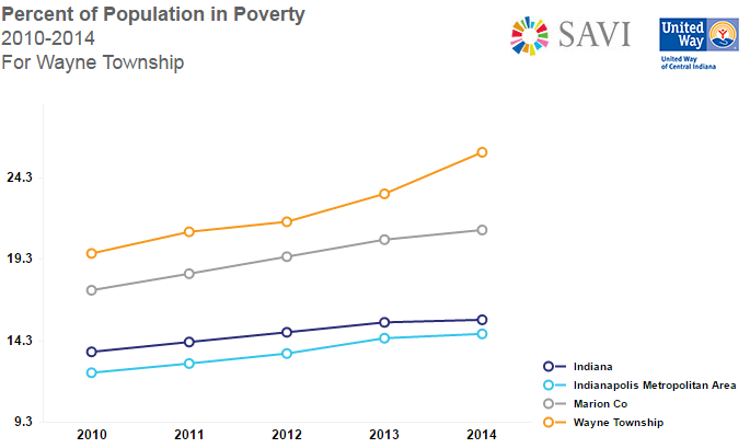
The default graph shows your area of scope over time, compared to the county, region, and state. Wayne Township’s poverty rate is over 10 points higher than Indiana’s average overall and has been steadily rising by about 2 points a year from 2012-2014.
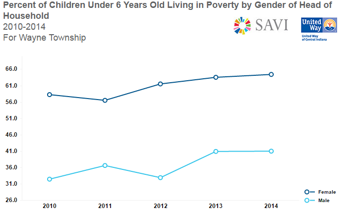
You can also drill down into particular populations in the line graph. We used a line graph here to show the percentage of children under six living in poverty. To make a graph based on gender, go to the dropdown menu in purple at the top of the screen and choose “gender”. This chart tells us that single-mother households experience poverty at a much higher rate than households headed by males.
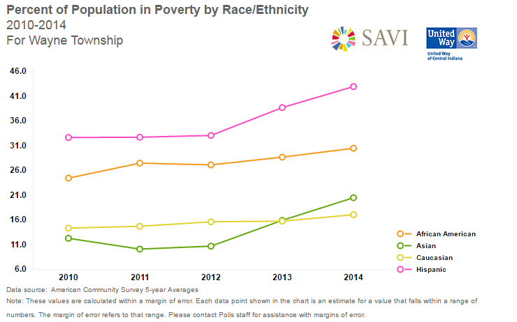
If we drill down by race in the line chart, we see that 43% of Hispanic/Latino individuals are in poverty. That has been climbing since 2012.
Remember: Click “Add to Report” ![]() on the upper right hand corner of the page to add graphs to your Assessment Report to view later.
on the upper right hand corner of the page to add graphs to your Assessment Report to view later.
Building Conclusions Based on Data
We found that:
- Hispanics and females overall are disproportionately impacted by poverty compared to others.
- Female-headed households experienced poverty at a higher rate than male-headed households (27% versus 39%). This difference was even more exaggerated for families with children under six (41% of male-headed households were in poverty, versus 64% of female-headed households).
- Overall, the age range of 0-5 is the highest percent of the population, at 41%, in poverty.
- Latinos make up 31 percent of the population in poverty, despite it being only 18% of the total population of Wayne Township.
This data helps us understand more specifically the needs facing the township where we serve. In a later blog entry we will explore what assets are available in our community, and use all this information to inform what kind of programming we undertake.
